Elevating Confectionery with a Health-Conscious Approach

As the Art Director for Lollitol, a vegan and health-focused confectionery brand, my role was to revitalize and uplift the brand's visual identity. Our objective was to create a fresh and inviting image that resonated with a diverse audience while emphasizing the brand's commitment to quality and well-being.
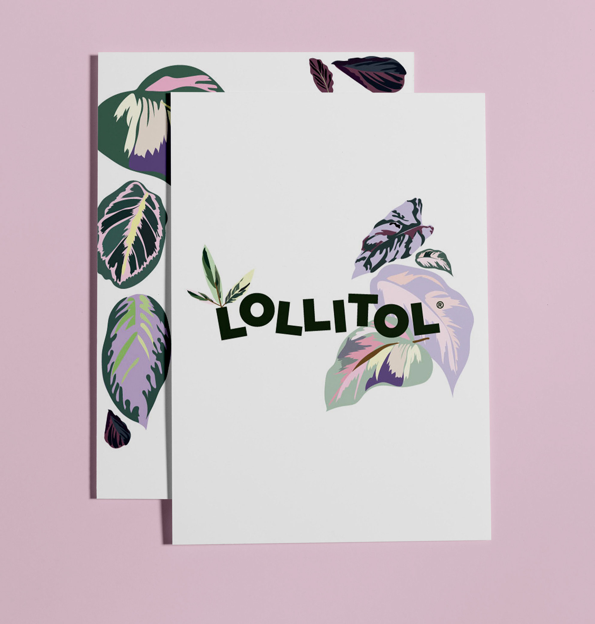
The first step in the brand transformation was simplifying the logo. We aimed to achieve a clean and modern look that embodied the essence of Lollitol. To do this, we incorporated a vibrant green tone that alludes to xylitol, the primary plant-based ingredient used in crafting the lollipops. This choice not only reinforces the brand's vegan philosophy but also visually communicates its commitment to health-consciousness.
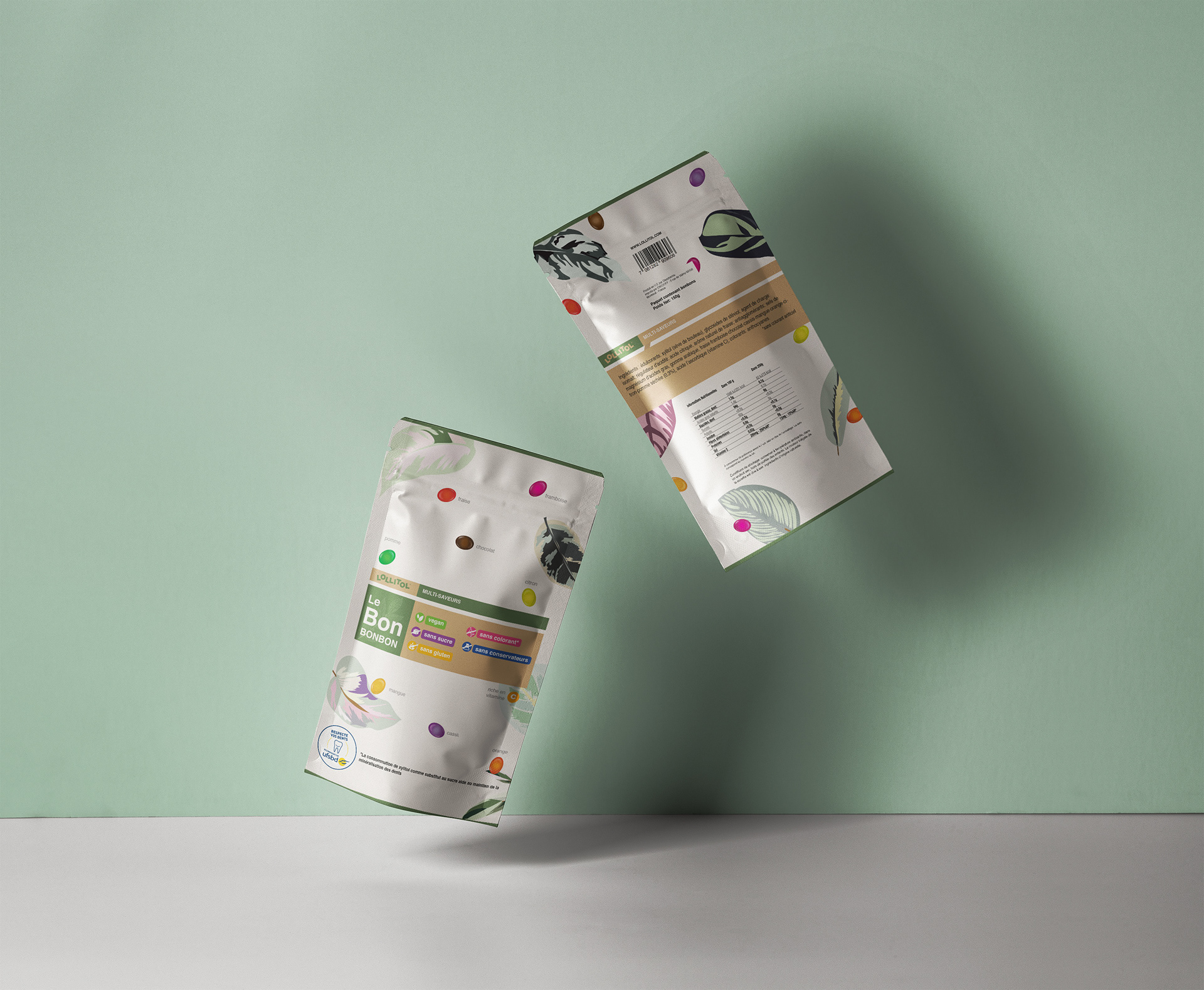
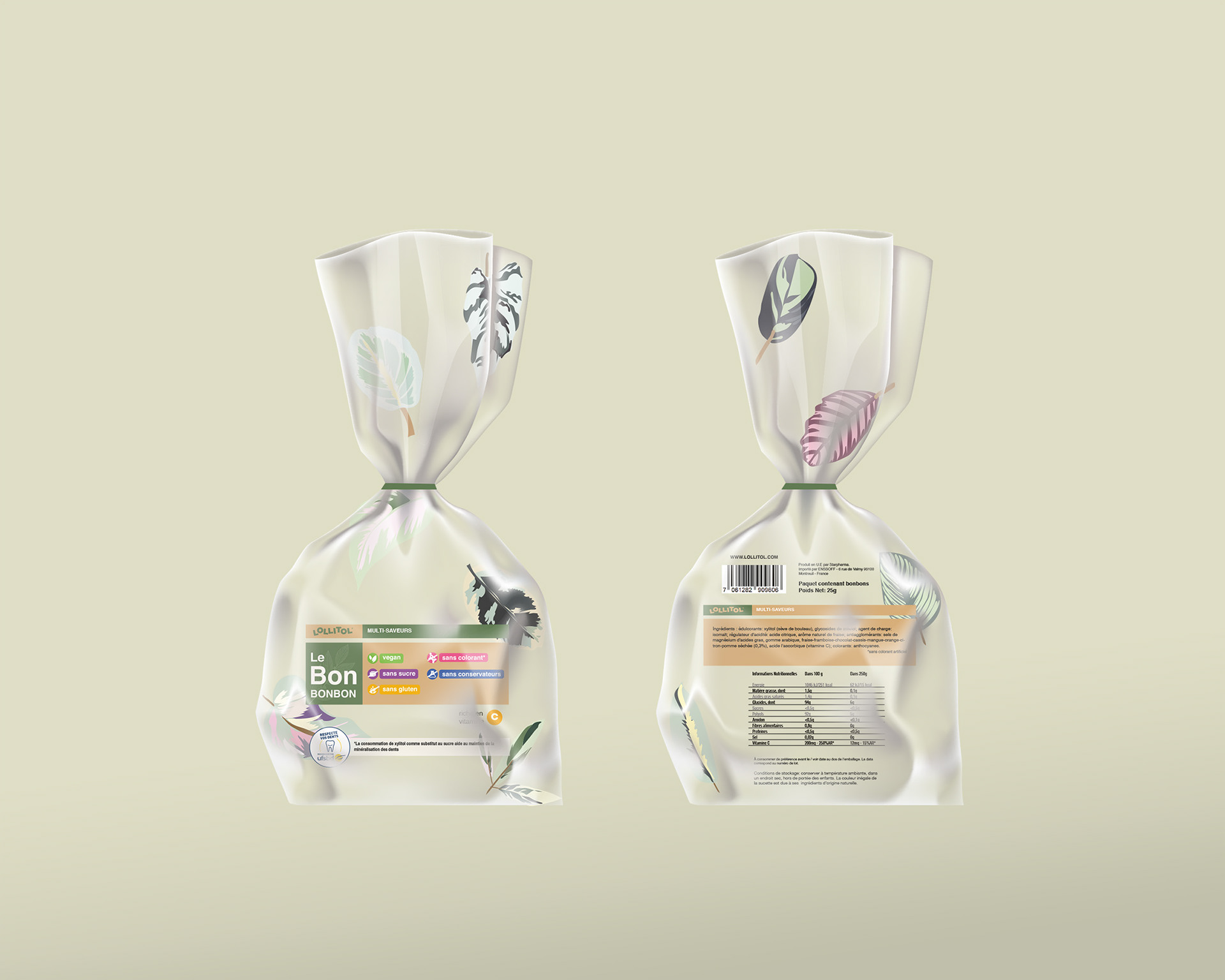
One of the initial challenges we faced was designing packaging that would be suitable for sale in pharmacies while appealing to a wide range of consumers. We recognized the importance of creating a target audience that extends beyond children, catering to health-conscious individuals of all ages. To achieve this, we devised a packaging concept with a white background, exuding a sense of cleanliness and purity.
To add a touch of botanical charm and align with the brand's natural ingredients, we incorporated beautiful botanical illustrations on the packaging. These illustrations not only enhance the visual appeal but also convey a sense of freshness and connection with nature, further reinforcing the brand's commitment to quality and well-being.

To distinguish between different flavors, we utilized a color-coding system. Each flavor is assigned a unique and vibrant color, allowing consumers to easily identify their preferred choice. This approach adds visual interest to the packaging, making it visually engaging and easy to navigate for customers.
Packaging Lollitol for Wide Distribution
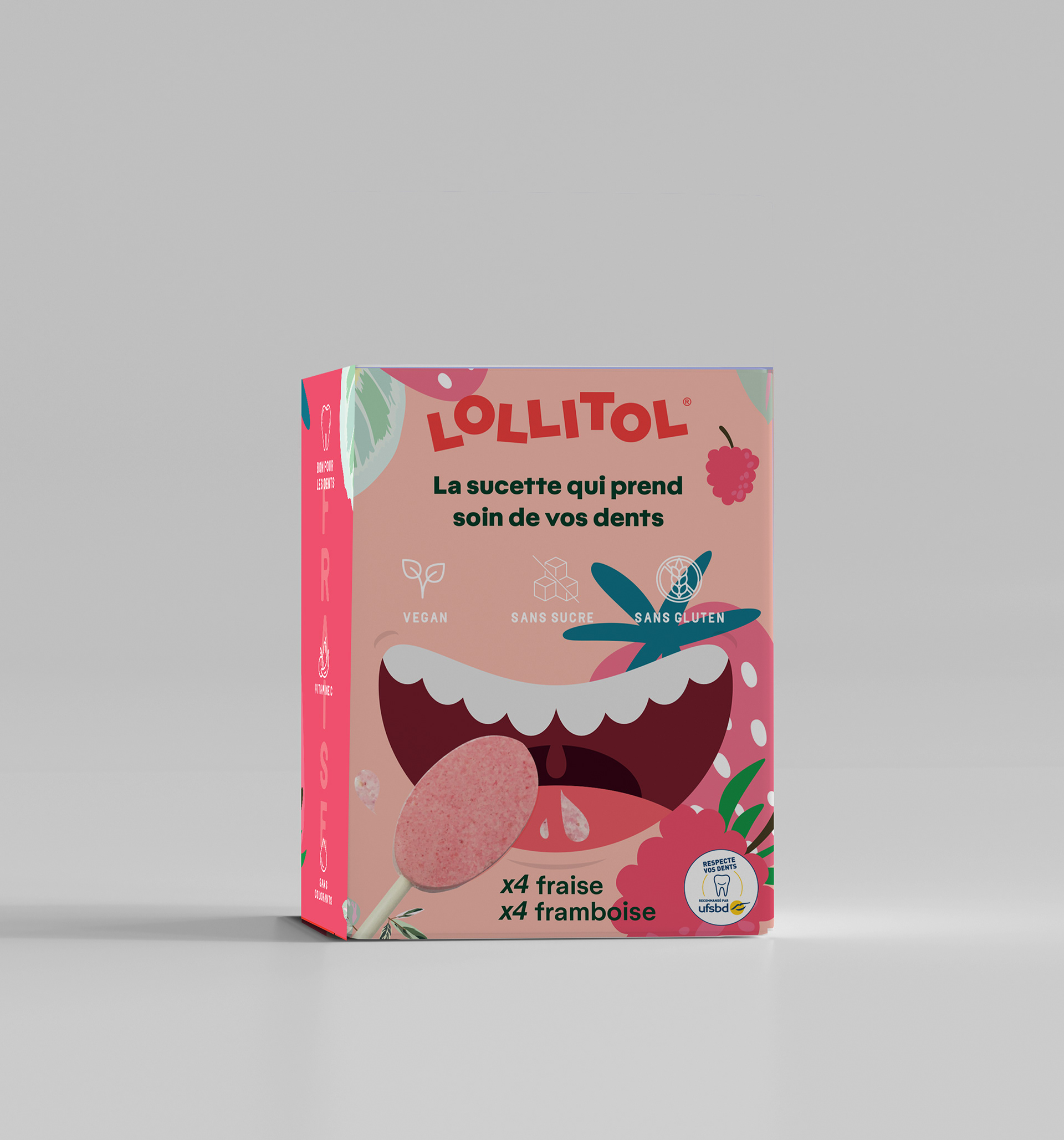
As we expand Lollitol into large-scale distribution, our objective is to transform the packaging to captivate customers in highly competitive retail environments. While maintaining the brand's aesthetic foundation, our aim is to create eye-catching packaging that entices potential customers to give Lollitol a try. We have decided to emphasize the brand's core strength: dental care.
To achieve this, we have developed a new packaging concept that showcases the fun and colorful nature of Lollitol while highlighting its oral health benefits. The packaging design is playful and vibrant, designed to catch the attention of shoppers and invite them to explore the delightful world of Lollitol lollipops.
Using bright and energetic colors, we create a visual experience that stands out among competitors on the store shelves. The packaging exudes a sense of excitement and joy, reflecting the pleasurable experience of enjoying Lollitol lollipops while promoting dental health.
Incorporating dynamic and engaging illustrations, we aim to create a sense of connection with the potential customers. These illustrations not only add visual appeal but also convey the message of dental care in a light-hearted and approachable manner. By presenting Lollitol as a tasty treat that also nurtures oral health, we encourage consumers to make a conscious choice for their well-being.
Furthermore, we have strategically placed key information on the packaging, such as the vegan and health-conscious nature of Lollitol lollipops, to inform and reassure customers of the product's quality and alignment with their values.
Our redesigned packaging for wide distribution encapsulates the essence of Lollitol - a brand that brings joy, flavor, and oral care together. With its fun and colorful appearance, it serves as an invitation for potential customers to explore the delightful and guilt-free indulgence that Lollitol offers.